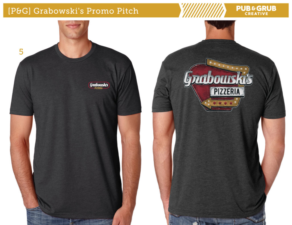
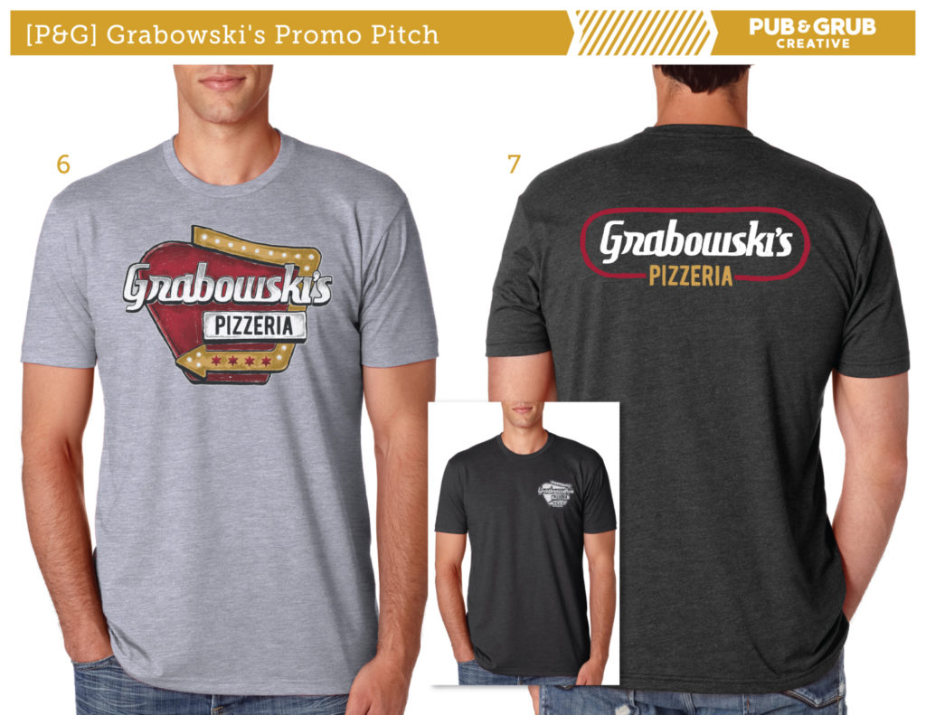
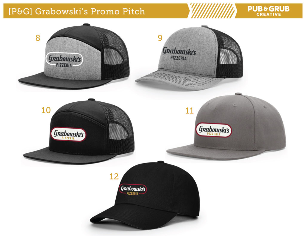
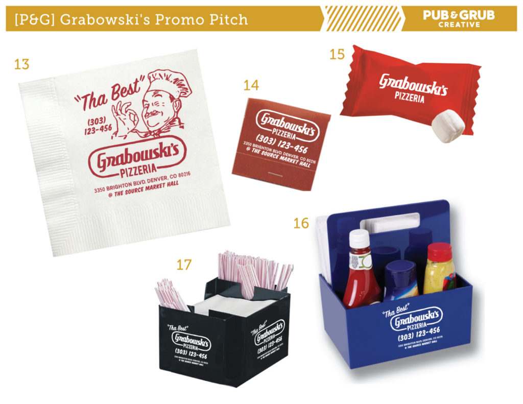
Bottom Line Up Front: Industry expert Jeremy Picker is back — this time to tell you not to overlook your design process. Upping your art content & graphics game is the way to increase your sales, customer satisfaction, and retention. Breakdown below.

Many prints shops operate by waiting to receive a design from the customer directly. In fact, I remember one shop that used to share pages and pages of graphic artists with their customers, so that customers could seek out their designs directly from them. It seemed like these shops were proud of not offering custom graphic design.
I’m here to tell you that not offering custom graphic design isn’t something to be proud of. It’s actually limiting — and hurting — your sales potential.
How? Keep reading.
The Context
Imagine the nightmare of relying on a smorgasbord of graphic artists, not knowing whether or not they have the knowledge to design for the subtleties and limitations of screen print or embroidery. Imagine relying on those artists to submit print files that were accurate and print-ready.
If you had 30 different designers, you’d be receiving 30 different art files. Technical accuracy aside, how are you supposed to control for the wearability of your clients’ apparel if you’re completely absent from the design process? Not only is relying on a disconnected third party — or 30 of them — destined to bring some volatile results, but it also has the power to dismantle your timeline. And your reputation.
So let’s get into one excellent example of how a well-executed design process can make or break a product. Let’s look at the graphic tee.
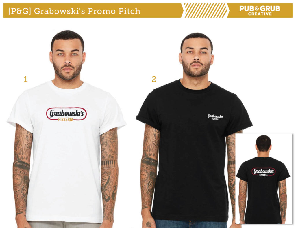
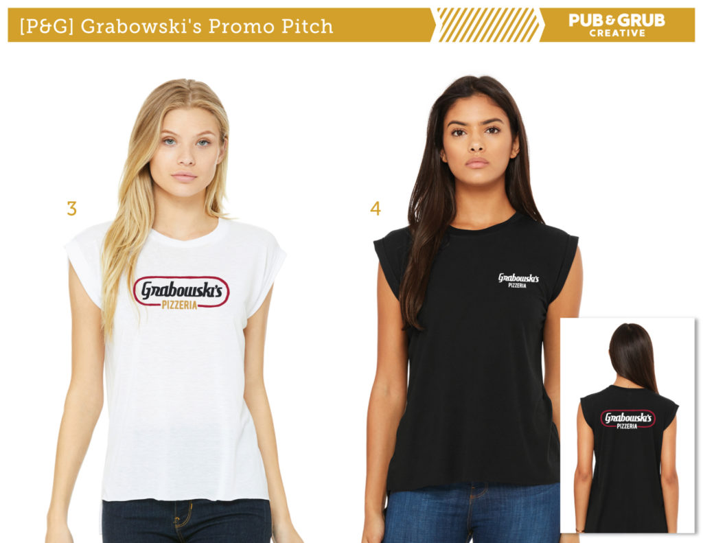
At its core, the graphic tee includes a client logo on a t-shirt or polo. But those of us in the industry know it’s so much more than just getting those two factors down. In order to elevate your business’s offerings beyond the basics, you need to be proactive in the creative part of the process. And that means being proactive when it comes to the design.
Sure, the logo will always be the tee’s foundation — but when you incorporate more than just the logo, when you incorporate the client’s branding into a lifestyle apparel design, that’s when you’ll see the magic happen. The graphic tee’s wearability increases, and you’ll find that the consumer dons it two to three times more often in social settings.
Those are the results that are possible when you start seeing graphics and art content capabilities as a major sales tool. Results like a better end-product, higher end-consumer satisfaction, and the customer retention that comes from hitting the mark.
The Design Process & Your Business
So how do you get to those results? I’ve compiled a list to help you get there. But before we get into the list, I want you to understand that the most important element to unlocking sales is showcasing to clients all that’s possible if they invest in developing a high-quality merchandise line. They need to get that “˜free designs’ are not the way to achieve high-quality results, and they need to believe in the design process as much as you do.
Whether you act as the creative mind at the helm, have a full in-house design team, or outsource to a select few trusted designers, this list will help you deliver a product pitch (and subsequent product) that will win over any client.
Enlist Help From Suppliers
Reach out to your core suppliers and ask if they have a current “˜trending items’ list. (They likely do.) Explain your client’s core demographic or event theme, and let them help you curate hot-selling items that fall into those niche categories.
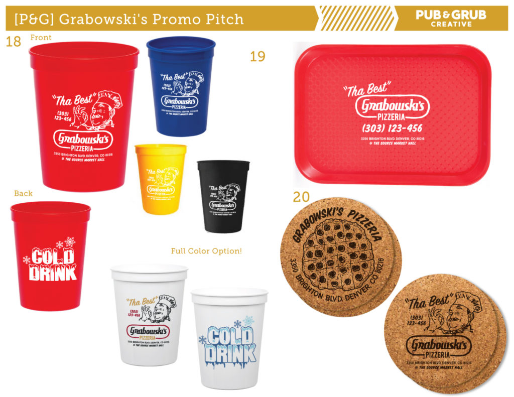
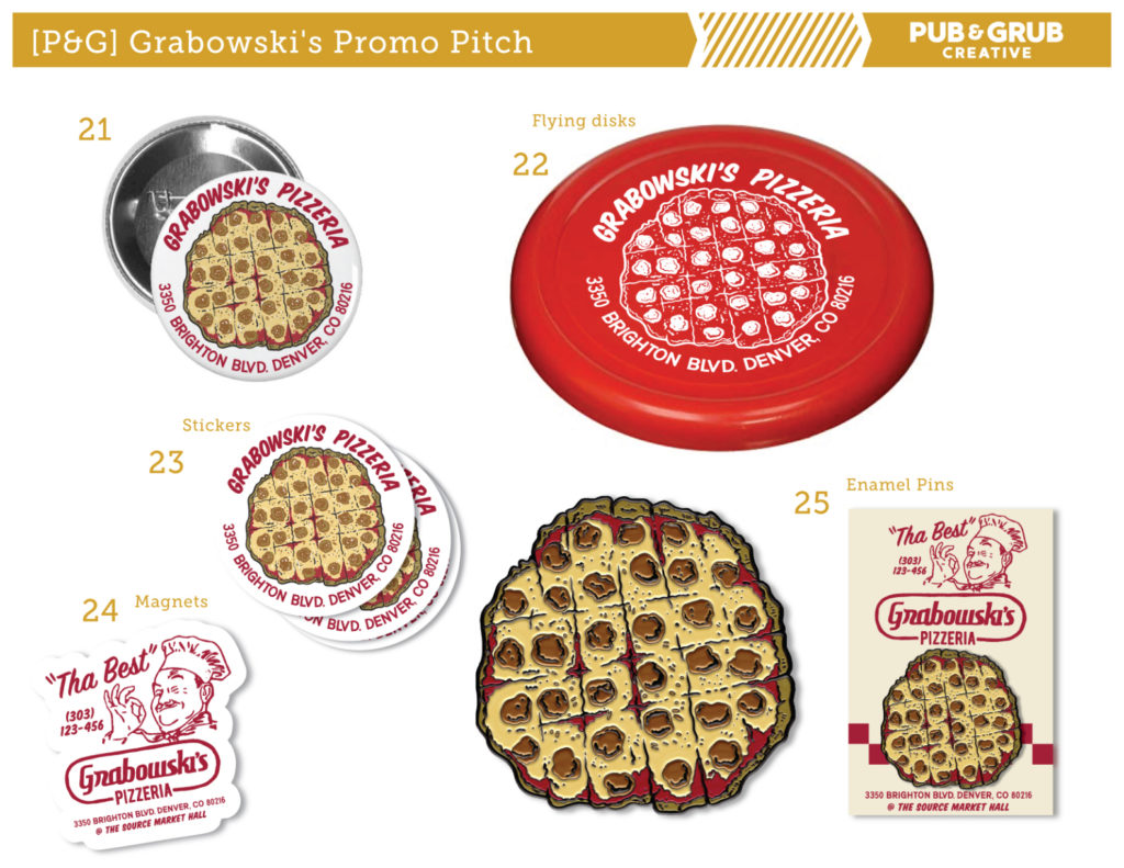
For promotional products, connect with your PCNA sales rep (or another supplier representative) and ask for their core item recommendations within a certain price range. Acquire the blank catalog images of their suggestions, and use them to compile a design pitch for the client.
Here’s the thing: if you succeed, your suppliers succeed. So use their expertise to help you lock in sales — and after you have their recommendations, all that’s left to do is create the design pitch. Simply use a template in PowerPoint, KeyNote, or InDesign. (And if you have the capabilities, a custom branded template is always a nice touch.)
Create A Mood Board
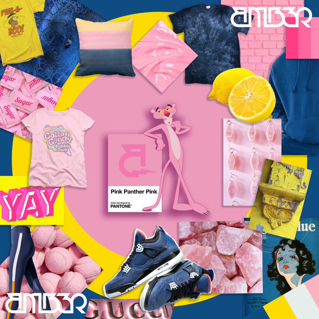
Based on initial conversations with your client regarding what they’re trying to achieve, gather market images that fall in line with their style and brand focus. Save images to a folder or put them together in a Pinterest board — however you choose to start accumulating your mood board, keep in mind that clear visuals always help the client picture their end-results (and boost their satisfaction with the process).
The images you choose work to create a visual story — for both the client and the designer(s) you work with. Everyone will have access to the same visuals, be on the same page when it comes to design intention, and have clear images to point at and use as benchmarks for the process.
Cultivate a Cohesive Line
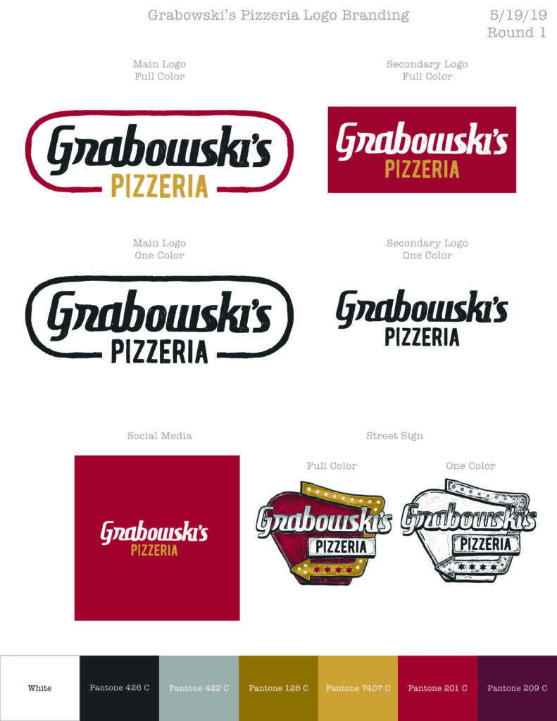
When looking at your design pitch, ask yourself whether or not the products look cohesive. If they were on a shelf next to each other, would they look harmonious? Would the colors, graphics, and branding of each product seem nicely coordinated?
Ever since my days traveling with bands, I’ve been painfully cognizant of misaligned merch offerings. I’d argue that this lack of product cohesion is due to the way most band merchandise companies run: a network of artists are asked to submit “spec” designs, and then the band chooses which they like best. The winning designs come from a multitude of artists with no connection to each other, and since only the winning designs receive payment, most artwork is half-baked at best. (And high-quality, professional artists rarely waste their time.)
The band merch industry’s “I’ll like it when I see it” approach doesn’t just hurt sales — it also hurts product. It’ll never allow for the right cohesive design to be established, which makes it difficult for a brand (or band) identity to be established — and conveyed — through its merchandise.
The importance of cohesive merch can be seen in retail apparel stores. Similar colors, graphics, and styles can be found on hats, tees, bags, shoes, belts, socks — and the list goes on. By following this retail approach, your customers won’t only sell more, but their consumers will keep their products in heavy rotation — increasing brand awareness (and your bottom line).
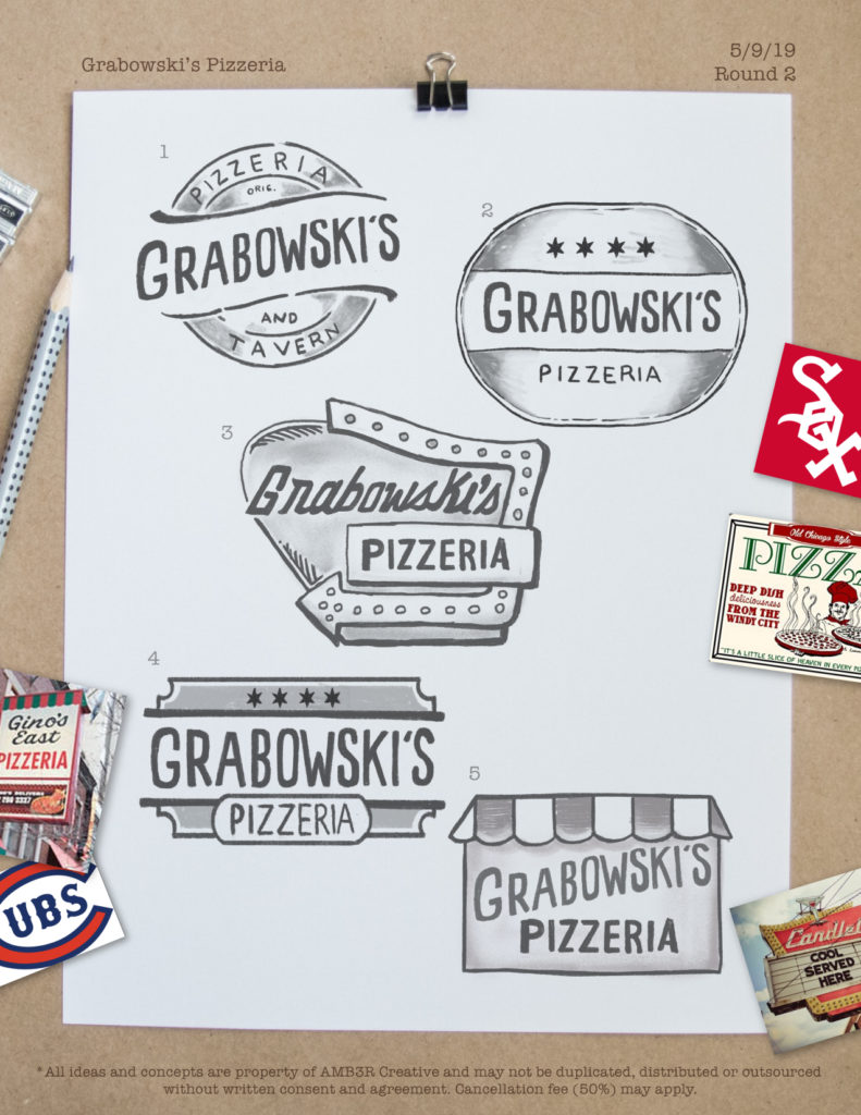
For clients with high-growth potential, it’s wise to go out on a limb and put together a pitch using original creative artwork. Exhibit the value of how your design prowess can elevate their brand look — beyond just their logo and internal graphics. Of course, this doesn’t make sense to do for all (or even most) of your clients, because of the time/resources involved — but if a high-value client trusts you, the time investment may help them move outside of the box. And that may earn you a big sales win.
In Conclusion: Graphics & Art Content Are Key to Sales
Trust me: most of your customers don’t just want the cheapest option. They want the option that their end-consumers will be excited to buy, excited to wear, and excited to keep wearing for years. As soon as you explain to them just how a high-quality design process can impact their end-goals, they’ll be on board.
And if they’re not — if they’re still whining that “the shop down the street offers free artwork!” — then you probably don’t want to work with them in the first place. If they value the cheapest possible option over high-quality results, then they’re never going to be happy with your work — because there will always be a cheaper seller.
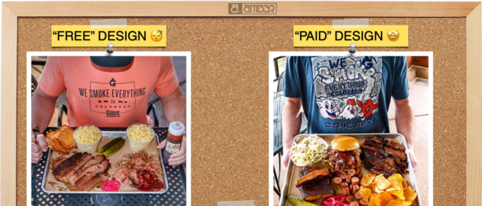
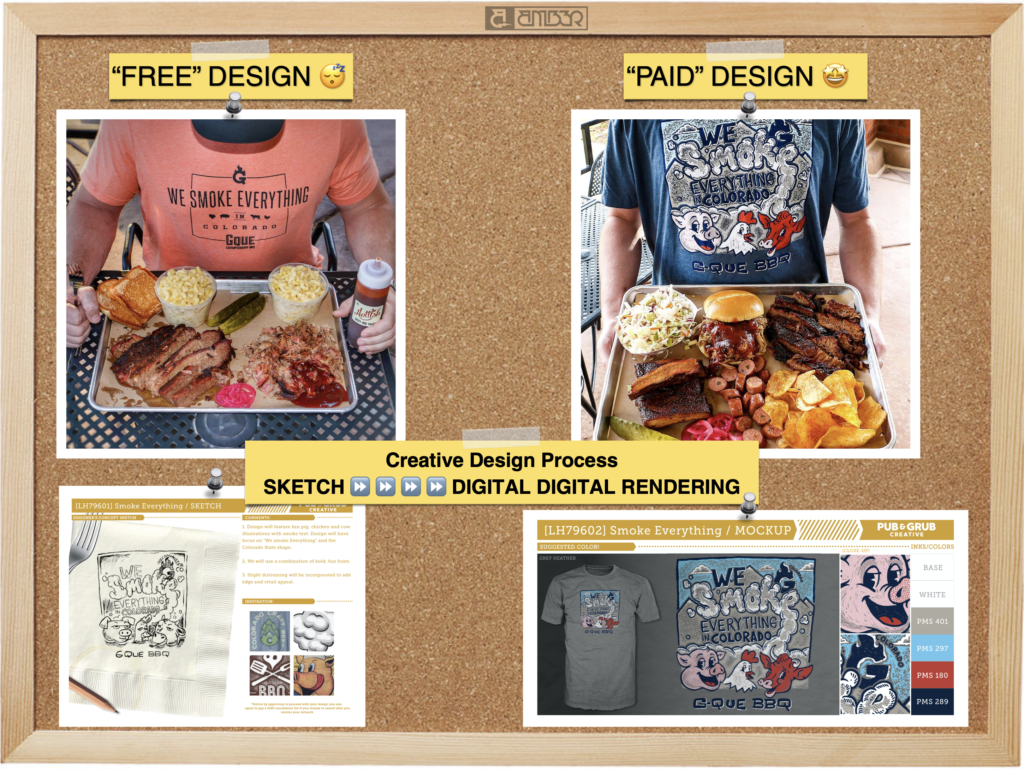
To give you a visual example, here’s a t-shirt that was created using a “Free Design” from the shop down the street, and here’s a t-shirt that was designed through a high-quality, paid process. The differences speak for themselves.
All of that said, there is a time, place, and customer for which it’s smart to speed up the process or dedicate as little labor as possible. But… offering “free art” won’t attract the customers you want to have on your roster. Artwork is the first thing people see, and it’s what differentiates your shop from the shop down the street. Think about what you want your artwork to say about your business — and then ask yourself, is your current artwork succeeding in conveying that message?
I challenge you to pick two or three customers (or prospects) to try out this process with.
Yes, it’ll require an investment of time and resources — but it’ll also pay-off with results. And, that investment won’t go unnoticed by the customers/prospects. They’ll see how badly you want their business, how you’re willing to go the extra mile, and that’ll differentiate you from the other print shops still only offering the bare minimum.
If you need a little extra help to push beyond your current status quo and get started with a new outlook on the design process, I’m happy to lend my expertise. Reach out to me on the InkSoft Facebook group and I’ll help 2-3 companies that want to step up their game — I’ll offer tips on items, colors, and decoration based on your customer demographic.
The InkSoft community is infinitely awesome, and I know that there’s room for all of us to win when we look out for — and help — each other.


