eCommerce Site Design
- Within the first few seconds, visitors need to understand where to find things on your site. The least bit confusion of where to find certain information on a site can lead to quick exits, higher bounce rates, and most importantly a loss of potential customers. Yikes.
The key here is keeping things as simple as possible. It’s important to let the product(s) and graphic(s) get the attention of the visitor, not the design of the website.
Designing a bold and eye-catching version of an eCommerce site is a common mistake, meaning that a move toward a more toned down version usually improve conversion. That said it is important that the site remains professional to gain the trust of your web traffic.
Rules for eCommerce layout
Keep it simple. Eliminating unnecessary clicks or functions is the key. An online shopping experience must be thoughtless…otherwise your traffic will split. The InkSoft user interface (UI) keeps a strict emphasis on simplicity.
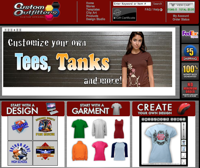
InkSoft Interface focuses on simplicity
Horizontal navigation: eCommerce experts advise using horizontal navigation. Horizontal navigational leads to a clean look that is easy to navigate. InkSoft maintains a horizontal UI when possible.
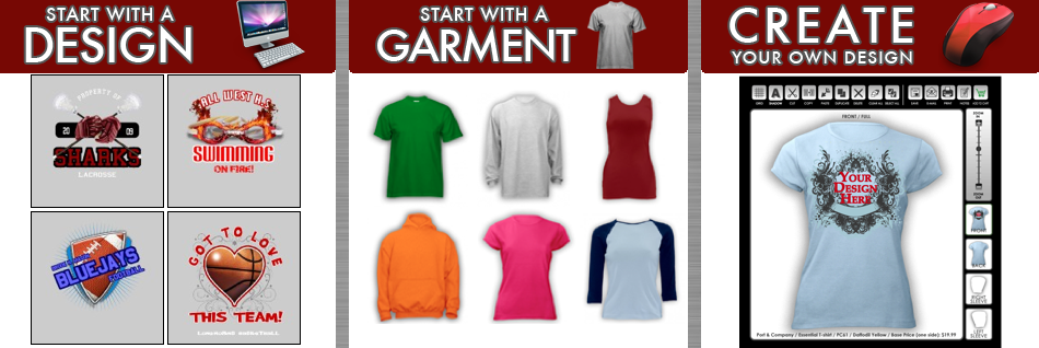
Horizontal Navigation is Optimal for eCommerce
Social Media: Many ecommerce stores don’t realize that a frightening percentage of visitors to your site may find it great, but just aren’t ready to buy and never come back. Leverage these potential buyers by encouraging them to share your products/graphics/services via their social media networks like Twitter, Facebook, MySpace etc. This way there is a better chance that they’ll remember your shop when they are ready to buy…plus you are creating free exposure to your web store! New trends show people are more willing to use social media tools than to give up their email address.
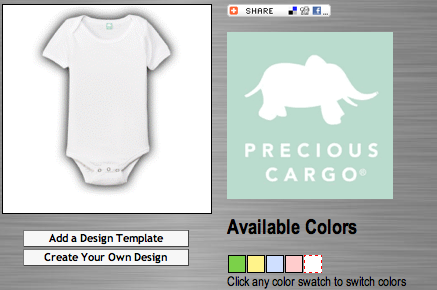
Social Media Tools in InkSoft
Product photography and viewability: In most cases, the easier it is for the visitor to see the product they want on the site, the higher the conversion rate will be. InkSoft offers huge previews to visitors can see detail and ‘experience’ the product and graphic.
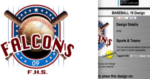
Large Preview of Graphics in InkSoft
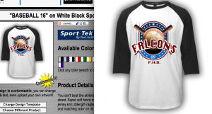
Large Preview of Products and Graphics
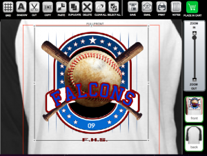
InkSoft Design Studio Zoom Function

