InkSoft Design Studio Update | User Interface & Experience
Today we’ve released an update to the design studio, which will enhance the user interface and user experience.
Design Studio Updates
This is the first of a series of updates we will be making to the design studio. Stay tuned as more come out! To best explain the updates this post will compare and contrast the old and new generations.
Also be sure to watch the video.
Update #1: Icons
Old Generation:
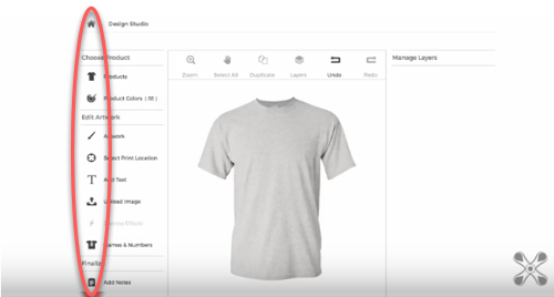
New Generation:
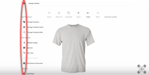
Change and Benefit: The icons now have a more modern and minimal aesthetic in addition to a reduced size. This gives more visual space and real estate to the design experience.
Update #2: Sections
Old Generation:
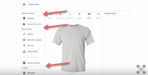
New Generation:
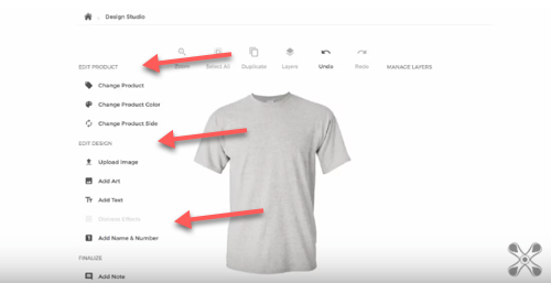
Change and Benefit: We’ve removed all the lines that were used to designate and break up the different sections. This adds to the minimal, clean, and modern design aesthetic that was requested.
Update #3: Print Location
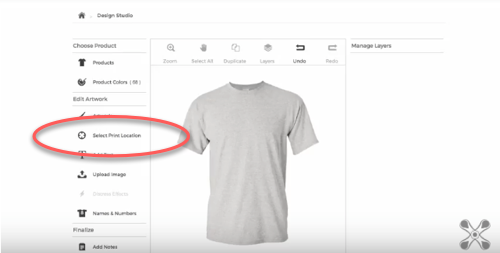
Old Generation:
New Generation:
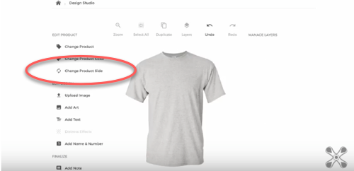
Change and Benefit: We’ve reorganized the “Select Print Location” functionality. As shown above, in the previous version, this function was organized under the “Edit Artwork” section. This is now repositioned to a more logical location, so that is grouped under “Edit Product.”
We’ve also renamed this function to “Change Product Side” and altered the modal window so that it is more logically organized and clear for the customer to make decisions on where they want their product decorated on.
Update #4: Upload Image
Old Generation:
New Generation:
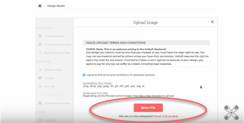
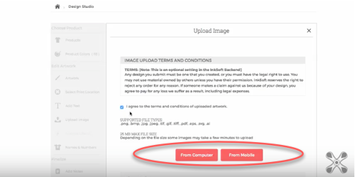
Change and Benefit: In the previous version your customers were presented two buttons to upload images: “From Computer” and “From Mobile.” In the newest version, there is now a primary button which is simply “Select File.” Since a majority of the traffic through InkSoft is from the desktop, this makes it more clear and easy for your #1 use case.
If you are not uploading from the computer, we now use clearer language for how your customer can send you their file saying: “File not on this computer? Email it to us here.”
Update #5: Font Selection
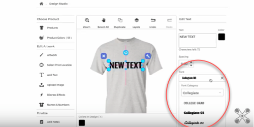
Old Generation:
New Generation:
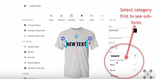
Change and Benefit: Previously when the customer went to add text they would have to select a “Font Category” from a drop down menu, and scroll through and select the font within that category simultaneously.
Now the design studio makes the users select a font category first before the sub-fonts are even visible. Only once they select the font category, will they have the ability to select a font within that category.
Questions?
Are online Stores still giving you trouble? Contact the Success Squad at support@inksoft.com, and we’ll help you out!
Still not a customer? Looking to improve the way your shop operates? We’d love to show you around.


Love the changes! Keep them coming!
Although I never had a problem with the design studio (because I guess I’m smarter than the average bear?), I was fine with everything. However, we got several comments over the last year from customers who felt it was all “too much” to do. Whatever that means. Perhaps they have no patience? Perhaps they’re just overwhelmed? Not sure, but our latest comment was from high schoolers who couldn’t figure out how to switch sides of the garment. I know, right? High schoolers? Shouldn’t this all be intuitive for Millenials? Who knows. Maybe that generation is technical, but still lazy? lol But I hope this helps them out!
One POSSIBLE suggestion, because as a semi-web designer myself, nothing can ever be clear enough… in the font selection drop-down menus at 4’20” of the video, perhaps make the option even clearer to say “Select FONT Category”. Then on the rebound at 4’35”, “< Back to Font Categories".
Or, perhaps one initial drop down menu of categories, that then displays a second category of fonts within the chosen category? I'm sure you've tested this option already.
I dunno… just thinking outloud here, but I do like my suggestions for renaming the selection options.
Thanks, everyone! Love ya!
Doug, thanks for your suggestion. Appreciate any and all suggestion we get on how we can improve the platform. I will forward your feedback to the design team and see what they can do with it. -Ryan
Hi there!
I’m loving how the new designer looks and I’m excited for all of the updates coming our way!
I’m not sure about others, but on the back-end when using the designer, I would love to have the option to select what type of decoration it is (embroidery, vinyl, screenprint, laser, etc..) so that when I get the orders in from the stores it’s much more direct direct for our printers. So when orders come in under Approve and Print Method(s), it would specifically say the decoration type instead of “Direct Print”. This might translate better for the customers as well. Just a suggestion.. keep up the great work!
Glad you are enjoying the new designer! An interesting idea and will definitely forward to our development team. If any other suggestions or ideas come up feel free to reach out to me directly at Ryan@InkSoft.com
Please consider making the design area much larger, it feels very cramped working within it’s confirmed area. The zoom function is not very helpful because everything is small.
Thanks
Rod, thanks for the suggestion. The zoom function addition was aimed to remedy this, but understand it can be improved. I will forward your suggestion to the team, and please continue to reach out with more suggestions!