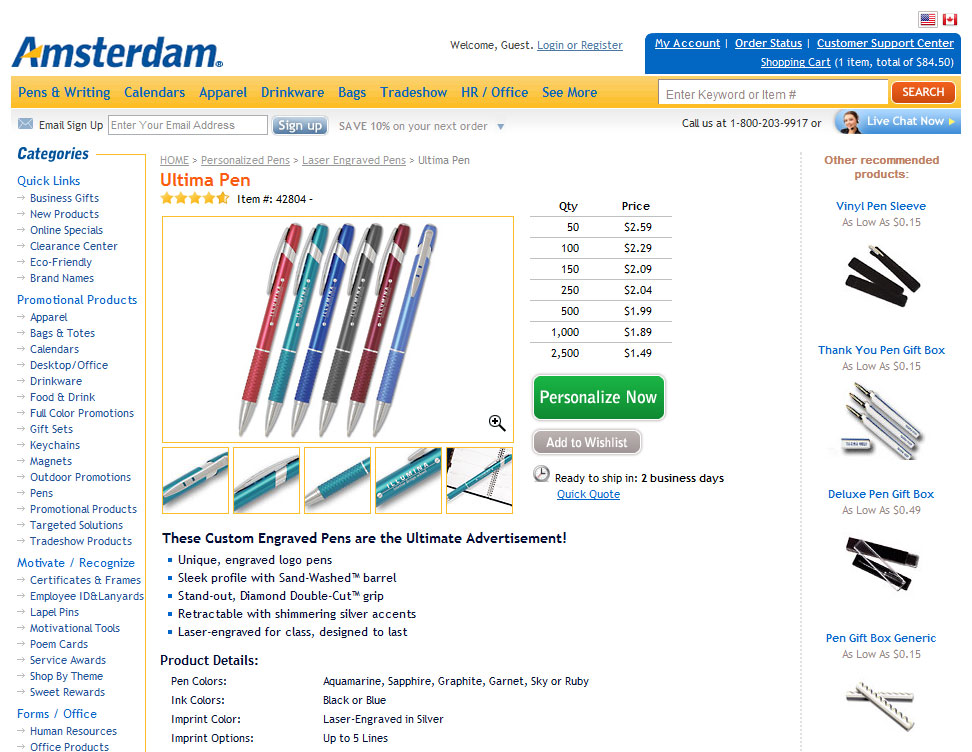
We found some very interesting data that has huge implications for InkSoft users. But first, a test.
From the images below, which button wording (see the green button text) lifted average revenue per visitor by 45% for customizable products?
Version A
Version B
What did you guess?
Version A “Personalize Now” had an average 45% lift in Revenue per Visitor over Version B’s button “Customize It”.
Amsterdam Printing conducted this template test using Test&Target across all customizable product pages, such as tote bag and trade show schwag offers. Only the button copy was tested “” everything else on the page remained the same. The test ran for 18 days and reached a 98.9% confidence level.
In total, 8 different buttons were tested, with Version A being the absolute winner. Losing buttons included a slightly bigger “Customize It” button, as well as buttons reading “Personalize & Buy”, “Buy Now”, “Get Started set up your imprint next”, “Personalize It set up your imprint next”, and “Order Now customize in next step”.
We couldn’t have predicted the winner of this test. We know we’re preaching to the choir, but when you’re not sure what copy to use, optimization testing can help you find your answer!
You can customize the default ‘customize-it!’ icon in InkSoft. See here.


That study is great, but if we are only allowed to enter a small 50X35 graphic in a space where we cannot test anywhere else it really does us no good. If you see the “Personalize It” button on Amsterdam’s site it is nice and BIG GREEN at a great location. Where our “star button” is now it really does no good. We need to be able to create a nice large button (bigger than 50X35) (100X70 is nowhere in my store) that draws attention so the customer doesn’t have to search for their next move. Also below that “Customize It” star those Hyperlinks “Create your own design” “Create your Quote” etc have no color and are in a small font. They are doing nothing there. We need to be able to Create BIG buttons for that as well very similar to the “Add to Cart” which Looks awesome.
Hey Frank. Thanks for the comment. We’ve experiemented with various sizes and found that the sizing we currently offer is ideal. Otherwise you compete with the graphic and it is quiet distracting. We will see about increasing the font size and adding a color.